Speed of sound lab, 21st century version

I love the standard lab used to measure the speed of sound using standing waves. I love the fact that it’s possible to measure physical quantities that are too fast to really visualize effectively.

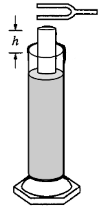
This image from the 1995 Physics B exam describes the basic set-up:
Screen Shot 2013-05-16 at 3.43.30 PM

The general procedure involves holding a tuning fork at the opening of the top of the tube and then raising and lowering the tube in the graduated cylinder of water until the tube ‘sings’ at the frequency of the tuning fork. The shortest height at which this occurs is the fundamental frequency of vibration of the air in the tube, and this can be used to find the speed of sound waves in the air.

The problem is in the execution. A quick Google search for speed of sound labs for high school and university settings all use tuning forks as the frequency source. I have always found the same problems come up every time I have tried to do this experiment with tuning forks:

  • Not having enough tuning forks for the whole group. Sharing tuning forks is fine, but raises the lower limit required for the whole group to complete the experiment.
  • Not enough tuning forks at different frequencies for each group to measure. At one of my schools, we had tuning forks of four different frequencies available. My current school has five. Five data points for making a measurement is not the ideal, particularly for showing a linear (or other functional) relationship.
  • The challenge of simultaneously keeping the tuning fork vibrating, raising and lowering the tube, and making height measurements is frustrating. This (together with sharing tuning forks) is why this lab can take so long just to get five data points. I’m all for giving students the realistic experience of the frustration of real world data collection, but this is made arbitrarily difficult by the equipment.

So what’s the solution? Obviously we don’t all have access to a lab quality function generator, let alone one for every group in the classroom. I have noticed an abundance of earphones in the pockets of students during the day. Earphones that can easily play a whole bunch of frequencies through them, if only a 3.5 millimeter jack could somehow be configured to play a specific frequency waveform. Where might we get a device that has the capacity to play specific (and known) frequencies of sound?

I visited this website and generated a bunch of WAV files, which I then converted into MP3s. Here is the bundle of sound files we used:
SpeedOfSoundFrequencies

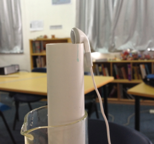
I showed the students the basics of the lab and was holding the earphone close to the top of the tube with one hand while raising the tube with the other. After getting started on their own, the students quickly found an additional improvement to the technique by using the hook shape of their earphones:
Screen Shot 2013-05-16 at 4.03.13 PM

Data collection took around 20 minutes for all students, not counting students retaking data for some of the cases at the extremes. The frequencies I used kept the heights of the tubes measurable given the rulers we had around to measure the heights. This is the plot of our data, linearized as frequency vs. 1/4L with an length correction factor of 0.4*diameter added on to the student data:
Screen Shot 2013-05-16 at 4.14.22 PM

The slope of this line is approximately 300 m/s with the best fit line allowed to have any intercept it wants, and would have a slightly higher value if the regression is constrained to pass through the origin. I’m less concerned with that, and more excited with how smoothly data collection was to make this lab much less of a headache than it has been in the past.

(Students) thinking like computer scientists

It generally isn’t too difficult to program a computer to do exactly what you want it to do. This requires, however, that you know exactly what you want it to do. In the course of doing this, you make certain assumptions because you think you know beforehand what you want.

You set the thermostat to be 68º because you think that will be warm enough. Then when you realize that it isn’t, you continue to turn it up, then down, and eventually settle on a temperature. This process requires you as a human to constantly sense your environment, evaluate the conditions, and change an input such as the heat turning on or off to improve them. This is a continuous process that requires constant input. While the computer can maintain room temperature pretty effectively, deciding whether the temperature is a good one or not is something that cannot be done without human input.

The difficulty is figuring out exactly what you want. I can’t necessarily say what temperature I want the house to be. I can easily say ‘I’m too warm’ or ‘I’m too cold’ at any given time. A really smart house would be able to take those simple inputs and figure out what temperature I want.

I had an idea for a project for exploring this a couple of years ago. I could try to tell the computer using levels of red, green, and blue exactly what I thought would define something that looks ‘green’ to me. In reality, that’s completely backwards. The way I recognize something as being green never has anything to do with RGB, or hue or saturation – I look at it and say ‘yes’ or ‘no’. Given enough data points of what is and is not green, the computer should be able to find the pattern itself.

With the things I’ve learned recently programming in Python, I was finally able to make this happen last night: a page with a randomly selected color presented on each load:
Screen Shot 2013-04-18 at 9.51.51 PM

Sharing the website on Twitter, Facebook, and email last night, I was able to get friends, family, and students hammering the website with their own perceptions of what green does and does not look like. When I woke up this morning, there were 1,500 responses. By the time I left for school, there were more then 3,000, and tonight when my home router finally went offline (as it tends to do frequently here) there were more than 5,000. That’s plenty of data points to use.

I decided this was a perfect opportunity to get students finding their own patterns and rules for a classification problem like this. There was a clearly defined problem that was easy to communicate, and I had lots of real data data to use to check a theoretical rule against. I wrote a Python program that would take an arbitrary rule, apply it to the entire set of 3,000+ responses from the website, and compare its classifications of green/not green to that of the actual data set. A perfect rule for the data set would correctly predict the human data 100% of the time.

I was really impressed with how quickly the students got into it. I first had them go to the website and classify a string of colors as green or not green – some of them were instantly entranced b the unexpected therapeutic effect of clicking the buttons in response to the colors. I soon convinced them to move forward to the more active role of trying to figure out their own patterns. I pushed them to the http://www.colorpicker.com website to choose several colors that clearly were green, and others that were not, and try to identify a rule that described the RGB values for the green ones.

When they were ready, they started categorizing their examples and being explicit in the patterns they wanted to try. As they came up with their rules (e.g. green has the greatest level) we talked about writing that mathematically and symbolically – suddenly the students were quite naturally thinking about inequalities and how to write them correctly. (How often does that happen?) I showed them where I typed it into my Python script, and soon they were telling me what to type.

rgbwork

In the end, they figured out that the difference of the green compared to each of the other colors was the important element, something that I hadn’t tried when I was playing with it on my own earlier in the day. They really got into it. We had a spirited discussion about whether G+40>B or G>B+40 is correct for comparing the levels of green and blue.

In the end, their rule agreed with 93.1% of the human responses from the website, which beat my personal best of 92.66%. They clearly got a kick out of knowing that they had not only improved upon my answer, but that their logical thinking and mathematically defined rules did a good job of describing the thinking of thousands of people’s responses on this question. This was an abstract task, but they handled it beautifully, both a tribute to the simplicity of the task and to their own willingness to persist and figure it out. That’s perplexity as it is supposed to be.

Other notes:

  • One of the most powerful applications of computers in the classroom is getting students hands on real data – gobs of it. There is a visible level of satisfaction when students can talk about what they have done with thousands of data points that have meaning that they understand.
  • I happened upon the perceptron learning algorithm on Wikipedia and was even more excited to find that the article included Python code for the algorithm. I tweaked it to work with my data and had it train using just the first 20 responses to the website. Applying this rule to the checking script I used with the students, it correctly predicted 88% of the human responses. That impresses me to no end.
  • A relative suggested that I should have included a field on the front page for gender. While I think it may have cut down on the volume of responses, I am hitting myself for not thinking to do that sort of thing, just for analysis.
  • A student also indicated that there were many interesting bits of data that could be collected this way that interested her. First on the list was color-blindness. What does someone that is color blind see? Is it possible to use this concept to collect data that might help answer this question? This was something that was genuinely interesting to this student, and I’m intrigued and excited by the level of interest she expressed in this.
  • I plan to take a deeper look at this data soon enough – there are a lot of different aspects of it that interests me. Any suggestions?
  • Anyone that can help me apply other learning algorithms to this data gets a beer on me when we can meet in person.

Volumes of Revolution – Using This Stuff.

As an activity before our spring break, the Calculus class put its knowledge of finding volumes of revolution to, well, find volumes of things. It was easy to find different containers to use for this – a sample:
DSC_0164

IMG_0573

We used Geogebra to place points and model the profile of the containers using polynomials. There were many rich discussions about wise placement of points and which polynomials make more sense to use. One involved the subtle differences between these two profiles and what they meant for the resulting volume through calculus methods:

Screen Shot 2013-04-08 at 4.19.33 PM

The task was to predict the volume and then use flasks and graduated cylinders to accurately measure the volume. Lowest error wins. I was happy though that by the end, nobody really cared about ‘winning’. They were motivated themselves to theorize why their calculated answer was above or below, and then adjust their model to test their theories and see how their answer changes.

As usual, I have editorial reflections:

  • If I had students calculating the volume by hand by integration every time, they would have been much more reluctant to adjust their answers and figure out why the discrepancies existed. Integration within Geogebra was key to this being successful. Technology greases the rails of mathematical experimentation in a way that nothing else does.
  • There were a few many lessons that needed to happen along the way as the students worked. They figured out that the images had to be scaled to match the dimensions in Geogebra to the actual dimensions of the object. They figured out that measurements were necessary to make this work. The task demanded that the mathematical tools be developed, so I showed them what they needed to do as needed. It would have been a lot more boring and algorithmic if I had done all of the presentation work up front, and then they just followed steps.
  • There were many opportunities for reinforcing the fundamentals of the Calculus concepts through the activity. This is a tangible example of application – the actual volume is either close to the calculated volume or not – there’s a great deal more meaning built up here that solidifies the abstraction of volume of revolution. There were several ‘aha’ moments and I saw them happen. That felt great.

Computational modeling & projectile motion, EPISODE IV

I’ve always wondered how I might assess student understanding of projectile motion separately from the algebra. I’ve tried in the past to do this, but since my presentation always started with algebra, it was really hard to separate the two. In my last three posts about this, I’ve detailed my computational approach this time. A review:

    • We used Tracker to manually follow a ball tossed in the air. It generated graphs of position vs. time for both x and y components of position. We recognized these models as constant velocity (horizontal) and constant acceleration particle models (vertical).
    • We matched graphical models to a given projectile motion problem and visually identified solutions. We saw the limitations of this method – a major one being the difficulty finding the final answer accurately from a graph. This included a standards quiz on adapting a Geogebra model to solve a traditional projectile motion problem.
    • We looked at how to create a table of values using the algebraic models. We identified key points in the motion of the projectile (maximum height, range of the projectile) directly from the tables or graphs of position and velocity versus time. This was followed with the following assessment
    • We looked at using goal seek in the spreadsheet to find these values more accurately than was possible from reading the tables.

After this, I gave a quiz to assess their abilities – the same set of questions, but asked first using a table…
Screen Shot 2013-03-08 at 6.55.40 PM
… and then using a graph:
Screen Shot 2013-03-08 at 6.57.23 PM

The following data describes a can of soup thrown from a window of a building.

  • How long is the can in the air?
  • What is the maximum height of the can?
  • How high above the ground is the window?
  • Is the can thrown horizontally? Explain your answer.
  • How far from the base of the building does the can hit the ground?
  • What is the speed of the can just before it hits the ground?</li

I was really happy with the results class wide. They really understood what they were looking at and answered the questions correctly. They have also been pretty good at using goal seek to find these values fairly easily.

I did a lesson that last day on solving the problems algebraically. It felt really strange going through the process – students already knew how to set up a problem solution in the spreadsheet, and there really wasn’t much that we gained from obtaining an algebraic solution by hand, at least in my presentation. Admittedly, I could have swung too far in the opposite direction selling the computational methods and not enough driving the need for algebra.

The real need for algebra, however, comes from exploring general cases and identifying the existence of solutions to a problem. I realized that these really deep questions are not typical of high school physics treatments of projectile motion. This is part of the reason physics gets the reputation of a subject full of ‘plug and chug’ problems and equations that need to be memorized – there aren’t enough problems that demand students match their understanding of how the equations describe real objects that move around to actual objects that are moving around.

I’m not giving a unit assessment this time – the students are demonstrating their proficiency at the standards for this unit by answering the questions in this handout:
Projectile Motion – Assessment Questions

These are problems that are not pulled directly out of the textbook – they all require the students to figure out what information they need for building and adapting their computer models to solve them. Today they got to work going outside, making measurements, and helping each other start the modeling process. This is the sort of problem solving I’ve always wanted students to see as a natural application of learning, but it has never happened so easily as it did today. I will have to see how it turns out, of course, when they submit their responses, but I am really looking forward to getting a chance to do so.

A computational approach to modeling projectile motion, part 3.

I’ve been really excited about how this progression is going with my physics class – today the information really started to click, and I think they are seeing the power of letting the computer do the work.

Here’s what we did last time:

In a fit of rage, Mr. Weinberg throws a Physics textbook while standing in the sand box outside the classroom. By coincidence, the book enters the classroom window exactly when it reaches its maximum height and starts to fall back down.


  • Is it appropriate to neglect air resistance in analyzing this situation? Justify your answer.
  • We want to use this problem to estimate the height of the classroom window above the ground. Identify any measurements you would take in order to solve this problem. (No, you may not measure the height of the classroom window above the ground.)
  • Use your spreadsheet to find the height of the window as accurately as you can.

Note: This activity got the students using the spreadsheet they put together last time to figure out the maximum height of the object. They immediately recognized that they needed some combination of dimensions, an angle, and a launch speed of the book.


These tables of values are easy to read, but we want to come up with a more efficient way to get the information we need to solve a problem.

The table below represents a particular projectile. Identify as much about its movement as you can. How high does it go? How far does it go? When does it get there? That’s the kind of thing we’re interested in here.

Screen Shot 2013-03-04 at 5.02.17 PM

Note that at this point the students are spending time staring at tables of equations. This is clearly not an efficient way to solve a problem, but it’s one that they understand, even the weakest students. They can estimate the maximum height by looking at the table of y-values, but the tedium of doing so is annoying, and this is what I want. I try to model this table of values with the spreadsheet they put together with them telling me what to do. Every time I change a value for initial speed or initial height, the location of the maximum changes. It’s never in the same place.

Eventually, someone notices the key to finding the maximum isn’t with the y-position function. It’s with the vertical velocity. When does the y-component equal zero?

This is where the true power of doing this on the spreadsheet comes alive. We look at the table of values, but quickly see that we don’t need a whole table. We go from this:
Screen Shot 2013-03-04 at 5.18.48 PM

…to this:
Screen Shot 2013-03-04 at 5.20.52 PM

Clearly this t-value is wrong. Students can adjust the value of the time in that cell until the velocity in the cell below is zero. A weak student will get how to do this – they are involved in the process. The tedium of doing this will prompt the question – is there a better way? Is this when we finally switch to an algebraic approach? No, not yet. This is where we introduce the Goal Seek tool.

Screen Shot 2013-03-04 at 5.23.12 PM

The spreadsheet will do the adjustment process for us and find the answer we are looking for. With this answer in hand, we can then move on to posing other questions, and using goal seek to find the values we are looking for.

The process of answering a projectile motion question (how far does it go? how high does it go?) through a spreadsheet then becomes a process of posing the right questions:
Screen Shot 2013-03-04 at 5.26.42 PM

This is the type of reasoning we want the students to understand within the projectile motion model. Whether your tool of choice for answering these questions is the graph, equations, or a table of values, posing these questions is the meat and potatoes of this entire unit in my opinion.

The next step is to then introduce algebraic manipulation as an even more general way to answer these questions, including in cases where we don’t have numbers, but are seeking general expressions.


Today I had a student answer the following questions using the goal seek method with the numerical models I’ve described above:

A ball is thrown horizontally from a window at 5 m/s. It lands on the ground 2.5 seconds later. How far does the ball travel before hitting the ground? How high is the window?

He solved it before anyone else. This is a student that has struggled to do any sort of algebraic manipulation all year. There’s something to this, folks. This is the opening to the fourth class of this unit, and we are now solving the same level questions as the non-AP students did a year ago with an algebraic approach and roughly the same amount of instruction time. Some things to keep in mind:

  • My students are consistently using units in all of their answers. It is always like pulling teeth trying to get them to include units – not so much at the moment.
  • They are spending their time figuring out the right questions to ask, not which equation to ‘plug’ into to get an answer.
  • They immediately see what information is missing in their model at the beginning of a problem. They read the questions carefully to see what they need.
  • The table of values gives them an estimate they can use for the problem. They have an idea of what the number should be from the table, and then goal seek improves the accuracy of the number.
  • At the end of the problem, students have all of the initial information filled out to describe all of the parts of the problem. They can check that the horizontal range, maximum height, and other waypoints of the path match the given constraints of the problem. This step of checking the answer is a built-in feature to the process of matching a model – not an extra step that I have to demand at the end. If it doesn’t match all of the given constraints, it is obvious.

I am looking for push back – is there anything I am missing in this approach? I get that deriving formulas is not going to come easily this way, but I think with a computer algebra system, it’s not far away.

Playing with robots – a weekend well spent

20130302-223610.jpg

This weekend marked the culmination of a few months of work from my robotics students. We traveled to Shanghai to compete in the FIRST Tech Challenge tournament with 47 other teams. I got involved in FIRST nine years ago when teachers at my school in the Bronx tracked me down after hearing of my engineering background. They had just won the Rookie of the Year award the season before, and were excited to have an engineer around to help. Given that it was my first year teaching, I wasn’t able to be nearly as involved as I wanted to be. It was enough of a hook to get me to see how powerful programs like FIRST really are for working on the ‘demand’ side of the educational system, the problem-solving-hands-on-building stuff that makes students see what the end game of education can be. Playing with robots on a competition field is no more ‘real world’ than estimating the number of pennies in a pyramid, but the learning opportunities in both are rich and demanding. Nine years later, I am still as convinced as ever that these are the types of activities our students need to understand the context of the skills we teach them in our classrooms.

This weekend, we met stiff competition from our Chinese competitors. They built cascaded elevator systems, scissor lifts, and sensor systems that helped to play this year’s game, a tic-tac-toe variant played using colored rings on a set of horizontal pegs. More impressive for me was seeing the mentors noticeably bored and checking their phones while the students were the ones focused on tweaking their robots and fixing programming snafus.

20130302-223653.jpg

This, however, was not our main challenge. The biggest issues that we faced were of our own creation – how to achieve consistency in our lifting mechanism using a web of zip-ties, or discovering just how unstable our own lifting mechanism was. The students were constantly sawing different parts of the robots off to make room for the solution to the last problem they created while trying to solve another. Clearing the complex residue of multiple good ideas to leave a simple, capable solution is the ultimate goal of a good design. The overall process of doing this is difficult, even with experience. They are early enough on the curve to know that there is much that they do not know though, and their positive and cheerful manner throughout was inspiring. Even after multiple technical issues and defeats on the field, they left the competition today feeling accomplished and full of ideas.

I was most inspired by my students’ reactions to seeing the clever designs of their Chinese counterparts. I have witnessed students wandering the pits at FIRST events and greeting unique and capable designs with accusation as the immediate reaction. “They could do that because they have so much more money” or “the mentors did all the work – it isn’t fair because we do everything on our team.” I understand the sentiment, but have always passed it off as being overly pessimistic. Some skilled teams make it look easy without always making obvious the associated level of effort required to execute such designs.

20130302-223712.jpg

What made me particularly proud of my students this weekend was seeing them look at other designs and go through two stages of processing them. First, they would remark how cool it was that the team was able to solve the problem in such a unique way. Second, with some thinking about just how, they would say something along the lines of we could have done that.

While our ranking was closer to the bottom than I (or they) will reluctantly reveal, I don’t care much at this point. The team is young and will hopefully have more opportunities to learn and build together over the next couple of years. Their satisfaction was evident in watching the final matches with a clear sense of accomplishment, even while not being part of them. Their sense of togetherness is stronger than ever.

Our bus lost its headlights on the way back, forcing us to spend an hour and a half at a repair place while the driver and nine other people figured it out while the usual pattern of loud Mandarin was punctuated with hacking and drags off cigarettes. The team, meanwhile, procured a healthy supply of snacks and seemed content to sing along to music played off their school laptops. This is a close group that has only grown closer. Easily the highlight of the whole weekend right there.

Computational Thinking & Spreadsheets

I feel sorry for the way spreadsheets are used most of the time in school. They are usually used as nothing more than a waypoint on the way to a chart or graph, inevitably with one of its data sets labeled ‘Series 1’. The most powerful uses of spreadsheets come from how they provide ways to organize and calculate easily.

I’ve observed a couple things about the problem solving process among students in both math and science.

  • Physics students see the step of writing out all of the information as an arbitrary requirement of physics teachers, not necessarily as part of the solution process. As a result, it is often one of the first steps to disappear.
  • In math, students solving non-routine problems like Three Act problems often have calculations scrawled all over the place. Even they are written in an organized way, in the event that a calculation is made incorrectly, any sets of calculations that are made must be made again. This can be infuriating to students that might be marginally interested in finding an answer in the first place.
  • Showing calculations in a hand written document is easy – doing so in a document that is to be shared electronically is more difficult. There are also different times when you want to see how the calculation was made, and other times that you want to see the results. These are often presented in different parts of a report (body vs. appendix) but in a digital document, this isn’t entirely necessary.

Here’s my model for how a spreadsheet can address some of these issues:
Screen Shot 2013-02-01 at 7.47.59 PM

Why I like it:

  • The student puts all of the given information at the top. This information may be important or used for subsequent calculations, or not. It minimally has all of the information used to solve a problem in one place.
  • The coloring scheme makes clear what is given and what is being being calculated.
  • The units column is a constant reminder that numbers usually have units. In my template, this column is left justified so that the units appear immediately to the right of the numerical column.
  • Many students aren’t comfortable exploring a concept algebraically. By making calculations that might be useful easy to make and well organized, this sets students up for a more playful approach to figuring things out.
  • Showing work is easy in a spreadsheet – look at the formulas. Depending on your own expectations, you might ask for more or less detail in the description column.

Some caveats:

    • A hand calculation should be done by someone to confirm the numbers generated by the spreadsheet are what they should be. This could be a set of test data provided by the teacher, or part of the initial exploration of a concept. Confirming that a calculation is being done correctly is an important step of trusting (but verifying, to quote Reagan for some reason) the computer to make the calculations so that attention can be focused on figuring out what the numbers mean.
    • It does take a bit of time to teach how to enter a formula into a spreadsheet. Don’t turn it into a lecture about absolute or relative addressing, or about rows and columns and which is which – this will come with practice. Show how numbers in scientific notation look, and demonstrate how to get a value placed in another cell. Get straight into making calculations happen among your students and in a way that is immediately relevant to what you are trying to do. Then change a given value, and watch the students nod when all of the values in the sheet change immediately.
    • Building off of what I just said, don’t jump to a spreadsheet for a situation just to do it. The structure and order should justify itself. Big numbers, nasty numbers, lots of calculations, or lots of given information to keep track of are the minimum for establishing this from the start as a tool to help do other things, not an end in and of itself.
    • Do not NOT

      NOT

      hand your students a spreadsheet that calculates everything for them. If a student wants to make a spreadsheet for a particular type of calculation, that’s great. That’s the student recognizing that such a tool would be useful, and making the effort to do this. If you hand them a calculator for one specific application, it perpetuates the idea among students that they have to wait for someone else that knows better than them to give them the tool to use. Students should have the ability to make their own utilities, and this is one way to do it.

Example from class yesterday:

We are exploring the way Newton’s Law of Gravitation is used. I asked students to calculate the force of gravity from different planets in the solar system pulling on a 65 kilogram person on Earth, with Wolfram Alpha as the source of data. Each of them used a scientific or graphing calculator to calculate their numbers, with the numbers they used written by hand (without units) on their papers with minimal consistency. They grumbled about the sizes of the numbers. When noticeable differences arose in magnitude between different students, they checked each other until they were satisfied.

I then showed them how to take the pieces of data they found and put them in the spreadsheet in the way I described above. In red, I highlighted the calculation for the magnitude of the force for an object on Earth, and then asked a student to give me her data. This was the value she calculated! I was quickly able to confirm the values that the other students also had made.

I then had them calculate the weight of an object on Earth’s surface using Newton’s law of gravitation. This sent them again on a search for data on Earth’s vital statistics. They were surprised to see that this value was really close to the accepted value for g = $latex 9.8;m/s^2$. I then asked them in their spreadsheet how they might figure out the acceleration due to gravity based on what they already knew. Most were able to figure out without prompting that dividing by the 65 kilogram mass got them there. I then had them use that idea and Newton’s Law of Gravitation to figure out how to obtain the acceleration due to gravity at a given distance from the mass center of a planet. I then had them use the spreadsheet model on their own to calculate the acceleration due to gravity on a couple of different planets, and it went really well.

The focus from that point on was on figuring out what those numbers meant relative to Earth. Often with these types of problems, students will calculate and be done with it. These left them a bit curious about each other’s answers (gravity on Jupiter compared to the Moon) and opened up the possibilities for subsequent lessons. I’ll write more about how I have grown to view spreadsheets as indispensable computing tools in the classroom in the future. A pure computational tool is the lowest level on the totem pole of applications of computers for learning mathematics or science, but it’s a great entry point for students to see what can be done with it.

Files:

Spreadsheet Calculation Template

Centripetal Acceleration of the Moon – a comparison we used two days ago to suggest how a 1/r^2 relationship might exist for gravity and the moon.


Angry Birds Project – Results and Post-Mortem

In my post last week, I detailed what I was having students do to get some experience modeling quadratic functions using Angry Birds. I was at the 21CL conference in Hong Kong, so the students did this with a substitute teacher. The student teams each submitted their five predictions for the ratio of hit distance to the distance from the slingshot to the edge of the picture. I brought them into Geogebra and created a set of pictures like this one:

Screen Shot 2013-01-29 at 7.57.47 AM

After learning some features of Camtasia I hadn’t yet used, I put together this summary video of the activity:

[wpvideo ysubHH3L]

I played the video, and the students were engaged watching the videos, but there was a general sense of dread (not suspense) on their faces as the team with the best predictions was revealed. This, of course, made me really nervous. They did clap for the winners when they were revealed, and we had some good discussion about modeling, which videos were more difficult and why, but there was a general sense of discomfort all through this activity. Given that I wasn’t quite able to figure out exactly why they were being so awkward, I asked them what they thought of the activity on a scale of 1 – 10.

They hated it.

I should have guessed there might be something wrong when I received three separate emails from the three members one team with results that were completely different. Seeing three members of one team work independently (and inefficiently) is something I’m pretty tuned in to when I am in the room, but this was bigger. It didn’t sound like there was much utilization of the fact that they were in teams. I need to ask about this, but I think they were all working in parallel rather than dividing up the labor, talking about their results, and comparing to each other.

Some things I want to remember about this:

  • I need to be a lot more aware of the level of my own excitement around activity in comparison to that of the students. I showed one of the shortened videos at the end of the previous class and asked what questions they really wanted to know. They all said they wanted to know where the bird would land, but in all honesty, I think they were being charitable. They didn’t really care that much. In the game, you learn shortly after whether the bird you fling will hit where you want it to or not. Here, they had to go through a process of importing a picture, fitting a parabola, and finding a zero of a function using Geogebra, and then went a weekend without knowing.

    While it is true that using a computer made this task possible, and was more enjoyable than being forced to do this by hand, the relativity of this scale should be suspect. “Oh good, you’re giving me pain meds after pulling my tooth. Let’s do this again!”

  • A note about pseudocontext – throwing Angry Birds in to a project does not by itself does not necessarily engage students. It is a way in. I think the way I did this was less contrived than other similar projects I’ve seen, but that didn’t make it a good one. Trying to make things ‘relevant’ by connecting math to something the students like can look desperate if done in the wrong way. I think this was the wrong way.
  • I would have gotten a lot more mileage out of the video if I had stopped it here:

    Screen Shot 2013-01-30 at 9.23.26 AM
    That would have been relevant to them, and probably would have resulted in turning this activity back around. I am kicking myself for not doing that. Seriously. That moment WAS when the students were all watching and interested, and I missed it.

Next time. You try and fail and reflect – I’m still glad I did it.

We went on to have a lovely conversation about complex numbers and the equation $latex x^{2}+4 = 0 $. One student immediately said that $ sqrt{-2} $ was just fine to substitute. Another stayed after class to explain why she thought it was a disturbing idea.

No harm done.

P.S. – Anyone who uses this post as a reason not to try these ideas out with their class and to instead slog on with standard lectures has missed the point. I didn’t do this completely right. That doesn’t mean it couldn’t be a home run in the right hands.

Rethinking my linear function approach in Algebra 2

My treatment of linear functions in the past has been pretty traditional. Solve for y, y = mx + b, graphing using slope intercept, then move on to linear inequalities in two variables…it is just dull this way. Most students have seen it before in one form or another, and it wasn’t exciting (or that novel) to them the first time they learned it. It doesn’t have to be this way, and I committed myself this year to doing things differently.

My approach has been centered on two big ideas:

  1. Linear functions have a constant rate of change. All of the other qualities they have are related to this important fact.
  2. There is an amazing connection between graphs, tables of values, and the equations that generate linear functions. These are not three separate skills, they are three views of the same fundamental mathematical object. Corollary: Teaching them on three separate days or sticking to one view at a time creates an unnecessary pigeon-holing effect that sticks with students for as long as conditions in your class permit.

On day one, we did my Robot Tracking activity posted here at GeogebraTube. The video introduction was reviewed in class and students worked on it for much of the period. This emphasized a fundamental concept around linear functions of distance and time that was pretty intuitive to nearly all of the students that did this activity.

Predicting where something is located, assuming it continues moving at a constant rate is one of the most common applications of linearity. We do it all the time. Can we cross the street in front of the bus? Mental calculation. Where should I kick the soccer ball to get it right in front of the forward moving toward the goal? Mental calculation. I don’t mean actually sitting down and calculating where it will be, but that the human brain is pretty good at noticing the velocity of objects, and making a pretty good guess of where it will be. They had a number of methods of coming to an answer that ranged from geometric (simply drawing a line) to counting grid squares, using the trace function, and proportional reasoning.

We ended the period looking at the Python script I posted here and trying to calculate speed from the information generated by the program. Part of the homework assignment for the next class was to try to answer the question posed by another Python program posted here. The table of values is randomly determined each time, and students could (and often did) try it multiple times to get it right.

The next lesson had a single instance of this program as a warm up for the whole class – everyone had to agree on what value of position I needed to enter for the given time value.. They were pretty good at checking each other and having good conversations about how to go about it. They answered correctly, but we had a good conversation about the different ways to get there. They all centered on using the fact that there was equal spacing between all of the points. Most students used some variation of finding the distance moved per second and whether it was positive or negative, and then counted off intervals. In most cases, it was a bit complicated and required a lot of accounting to get to their answer.

We went over the reason we could do this – the constant rate of change – and verified it using a few different pairs of points. I then threw in the idea of using the point (x,y) and using the constant rate of change with that point. We got to $latex frac{y – b}{x – a}=m $ and I asked them to write this using the slope we calculated and any point they liked from the table of data. Students seated next to each other I encouraged to use different points. I then asked them to answer the original question from the Python program using their equation. (Un)surprisingly enough, they all ended up with the correct (and same) answer as before.

Some of them started distributing and writing in slope intercept form. THe thing I was kind of excited about was that they didn’t feel the equation had to be written that way, they just felt like seeing what happened. Many discovered the fact that their answers were the same after doing so, even though they started with different points. We did a couple examples of solving more basic ‘Write an equation for a line that…” questions, but did so without making a huge deal out of slope-intercept form or point-slope form and why one might be better than the other in different situations.

Today was the third day going through this concept – the warm up activity had three levels to it:

The goal here was to constantly push the students to go back and forth between the equation and numerical representations of these functions. There were lots of good things students figured out from these. We then made the jump to looking at how the graph is connected to the table and equation – just one more way of looking at the same mathematical function, and it shares the meaning that comes with the other two representations: a constant rate of change. The new idea introduced as part of this was that of an intercept. What does it mean on the graph? What does it mean for the table? We didn’t talk explicitly about the intercept’s meaning of the equation (again, trying to avoid the “that’s just y = mx + b, I know this already…TUNED OUT”) , but it came out in the process of identifying it algebraically, from tables, and then graphing.

By the end of the period, we were graphing linear functions. Students were asking excellent questions about when the intercepts alone can be used to graph the line, when they can’t ($latex 2x+3y=6$ versus $latex 2x+3y=7$) but they again stuck to the idea of finding a point they know is on the graph, and then using the constant rate of change to find others. Instead of spending a boring lesson explicitly telling them what my expectations are for graphing lines (labeled and scaled axes, line going all the way across the extent of the axes, arrows on axes and lines) I was able to gently nudge students to do this while they worked.

We’ll see how things go as we continue to move forward. The big thing I like about this progression so far is that modeling real phenomena will be a natural extension of what we’ve already done – not a lesson at the end of contrived examples with clean numbers. My goal originally was to get this group comfortable with messy data and being comfortable with using different tools to make sense of it.

I’ve kept my students hermetically sealed from this messiness in the past – integer coefficients, integer values, and explicit step-by-step ways of graphing, generating tables, and writing equations. As I mentioned before, it was, well, boring and predictable, and perpetuated the idea that these skills are all separated from each other. It also continued the pattern that there would be a day in each unit where the numbers are messy, the real world word problems day, but that the pain associated with it would last a day and would be over soon enough.

I’m hoping to reduce this effect by changing my approach. That by seeing the different aspects of linear functions, it will seem natural to use a graph to figure out something that might not make sense algebraically, or use numerical values to solve an algebraic problem. I especially like this because exploring the three views of functions really is, in my opinion, the primary learning goal of the Algebra 2 course. If I can establish this as an expectation early on, I think the latter parts of the course will work much more smoothly.
Using Geogebra to develop Newton’s 2nd Law

I have been following as closely as possible the Modeling Physics approach with my regular physics students this year. My schedule during the summer has kept me from attending a workshop, so much of what I am doing is just an approximation of the real thing, as close to what I understand from the notes on the Modeling instruction website as I can get. We just finished the constant velocity unit last week, and were ready to look at some dynamics of objects. I am starting by looking just at the balanced force particle model before going to the constant acceleration model.

I started the particle force model unit by giving students a chance to play with a cart on an air track with some fans either turned on, or turned off. I had them make observations of what they saw. When they made assertions of constant velocity, I asked them to measure and verify their assertions. They asked to use the ultrasonic detector – I was more than willing to oblige their request. They collected some data, made some graphs, and talked about constant velocity, but they had trouble getting the detector to detect the cart without getting noise in their data. They were pretty sure that they could look past the noise in the ultrasonic detector data and create a constant velocity model. We also thought about taking a video and using Tracker, but given the odd interactions I’ve seen with Tracker and Mac OSX Lion, I opted not to endorse that without looking more into the problems that arose (Xuggle just not installing in one case, two computers becoming unbootable in another, and my own laptop suddenly getting its setting wiped and wireless obliterated until a rest of the system configuration. I digress – a discussion for another day.)

We then talked about drawing system schema and the ideas of forces as interactions between objects before heading off for the day. I knew we needed something to play with to help develop the connection between net force and constant velocity for the next class. My old standby, Geogebra, was there to help.

I created the Geogebra applet above at http://geogebratube.org/material/show/id/17438 and had my students go through the steps of making the object appear to travel at constant velocity by adjusting the magnitudes of the forces.

The steps:
• Adjust the sizes of the forces so that the object appears to move at constant velocity.
• Turn on the position versus time graph using the check box to confirm that it is actually traveling at
constant velocity. What should you be looking for?
• Create three different situations of constant velocity by changing the magnitudes of forces AND the initial velocity. Write down the settings you used for F1, F2, m, and v0 so we can compile them in one place when you are done.

Turning on the position vs. time graph, the students could then check and see if it was constant velocity using their knowledge from the last unit. I was really pleased that getting students to see the graph and figure out how to make adjustments took no prompting. The time we spent on constant velocity paid off, as they did a great job of then matching the graph to their observations and adjusting the forces as needed.

Before long, they had started talking themselves about how the object travels at constant velocity when the forces are equal. They asked if they could just take screenshots of the situations of constant velocity rather than just writing down their values for force, mass, and initial velocity. This made it easy to go one by one through their configurations and see what they had in common. We developed together the definition of net force, and then they adapted it to what they had figured out to come up with the static version of Newton’s 2nd.

I was especially impressed when I had them work individually to answer the following questions – their explanations came more naturally than ever before as non-chalant statements of fact, and without the “yeah, but…” moments that have shown up every other time I introduce the idea of net force.

The questions:

I am a big believer in having real objects in front of the students to manipulate and observe. I also like when the equipment works well enough to make it easy to make the measurements and observations students want/need to take. I thought this was a nice compromise between having an ideal, noise free (virtual) environment and giving enough flexibility for the students to play around themselves with the different parameters for the problem.