
Half Full Activity – Results and Debrief

If you haven’t yet participated, visit http://apps.evanweinberg.org/halffull/ and see what it’s all about. If I’ve ever written a post that has a spoiler, it’s this one.
First, the background.
“A great application of fractions is in cooking.”
At a presentation I gave a few months ago, I polled the group for applications of fractions. As I expected, cooking came up. I had coyly included this on the next slide because I knew it would be mentioned, and because I wanted the opportunity to call BS.
While it is true that cooking is probably the most common activity where people see fractions, the operations people learn in school are never really used in that context. In a math textbook, using fractions looks like this:

In the kitchen, it looks more like this:

A recipe calls for half of a cup of flour, but you only have a 1 cup measure, and to be annoying, let’s say a 1/4 cup as well. Is it likely that a person will actually fill up two 1/4 cups with flour to measure it out exactly? It’s certainly possible. I would bet that in an effort to save time (and avoid the stress that is common to having to recall math from grade school) most people would just fill up the measuring cup halfway. This is a triumph of one’s intuition to the benefits associated with using a more mathematical methods. In all likelihood, the recipe will turn out just fine.
As I argued in a previous post, this is why most people say they haven’t needed the math they learned in school in the real world. Intuition and experience serve much better (in their eyes) than the tools they learned to use.
My counterargument is that while relying on human intuition might be easy, intuition can also be wrong. The mathematical tools help provide answers in situations where that intuition might be off and allows the error of intuition to be quantified. The first step is showing how close one’s intuition is to the correct answer, and how a large group of people might share that incorrect intuition.
Thus, the idea for half full was born.
The results after 791 submissions: (Links to the graphs on my new fave plot.ly are at the bottom of the post.)
Rectangle

Mean = 50.07, Standard Deviation = 8.049
Trapezoid

Mean = 42.30, Standard Deviation = 9.967
Triangle

Mean = 48.48, Standard Deviation = 14.90
Parabola

Mean = 51.16, Standard Deviation = 16.93
First impressions:
- With the exception of the trapezoid, the mean is right on the money. Seems to be a good example of wisdom of the crowd in action.
- As expected, people were pretty good at estimating the middle of a rectangle. The consistency (standard deviation) was about the same between the rectangle and the trapezoid, though most people pegged the half-way mark lower than it actually was on the trapezoid. This variation increased with the parabola.
- Some people clicked through all four without changing anything, thus the group of white lines close to the left end in each set of results. Slackers.
- Some people clearly went to the pages with the percentage shown, found the correct location, and then resubmitted their answers. I know this both because I have seen the raw data and know the answers, and because there is a peak in the trapezoid results where a calculation error incorrectly read ‘50%’.
I find this simultaneously hilarious, adorable, and enlightening as to the engagement level of the activity.
Second Impressions
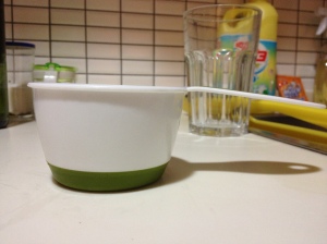
- As expected, people are pretty good at estimating percentage when the cross section is uniform. This changes quickly when the cross section is not uniform, and even more quickly when a curve is involved. Let’s look at that measuring cup again:
In a cooking context, being off doesn’t matter that much with an experienced cook, who is able to get everything to balance out in the end. My grandmother rarely used any measuring tools, much to the dismay of anyone trying to learn a recipe from her purely from observing her in the kitchen. The variation inherent in doing this might be what it means to cook with love.
- My dad mentioned the idea of providing a score and a scoreboard for each person participating. I like the idea, and thought about it before making this public, but decided not to do so for two reasons. One, I was excited about this and wanted to get it out. Two, I knew there would probably be some gaming the system based on resubmitting answers. This could have been prevented through programming, but again, it wasn’t my priority.
- Jared (@jaredcosulich) suggested showing the percentage before submitting and moving on to the next shape. This would be cool, and might be something I can change in a later revision. I wanted to get all four numbers submitted for each user before showing how close that user was in each case.
- Anyone who wants to do further analysis can check out the raw data in the link below. Something to think about : The first 550 entries or so were from my announcement on Twitter. At that point, I also let the cat out of the bag on Facebook. It would be interesting to see if there are any data differences between what is likely a math teacher community (Twitter) and a more general population.
This activity (along with the Do You Know Blue) along with the amazing work that Dave Major has done, suggests a three act structure that builds on Dan Meyer’s original three act sequence. It starts with the same basic premise of Act 1 – a simple, engaging, and non-threatening activity that gets students to make a guess. The new part (1B?) is a phase that allows the student to play with that guess and get feedback on how it relates to the system/situation/problem. The student can get some intuition on the problem or situation by playing with it (a la color swatches in Do You Know Blue or the second part of Half Full). This act is also inherently social in that students easily share and see the work of other students real time.
The final part of this Act 1 is the posing of a problem that now twists things around. For Half Full, it was this:

Now that the students are invested (if the task is sufficiently engaging) and have some intuition (without the formalism and abstraction baggage that comes with mathematical tools in school), this problem has a bit more meaning. It’s like a second Act 1 but contained within the original problem. It allows for a drier or more abstract original problem with the intuition and experience acting as a scaffold to help the student along.
This deserves a separate post to really figure out how this might work. It’s clear that this is a strength of the digital medium that cannot be efficiently done without technology.
I also realize that I haven’t talked at all about that final page in my activity and the data – that will come later.
A big thank you to Dan Meyer for his notes in helping improve the UI and UX for the whole activity, and to Dave Major for his experience and advice in translating Dan’s suggestions into code.
Handouts:
Graphs
The histograms were all made using plot.ly. If you haven’t played around with this yet, you need to do so right away.
Rectangle: https://plot.ly/~emwdx/10
Trapezoid: https://plot.ly/~emwdx/11
Triangle: https://plot.ly/~emwdx/13
Parabola: https://plot.ly/~emwdx/8
Raw Data for the results presented can be found at this Google Spreadsheet.
Technical Details
- Server side stuff done using the Bottle Framework.
- Client side done using Javascript, jQuery, jQueryUI, Raphael for graphics, and JSONP.
- I learned a lot of the mechanics of getting data through JSONP from Chapter 6 of Head First HTML5 Programming. If you want to learn how to make this type of tool for yourself, I really like the style of the Head First series.
- Hosting for the app is through WebFaction.
- Code for the activity can be found here at Github.
Estimating graphically where the factor is other than a multiple of 2 is non-trivial. I don;t think the mind works that way, that is where math would be needed. I can do thirds on regular shapes, but mostly rectangles.
-Dad
Excellent point, Dad. I remember talking fractions to sixth graders, and Pat O’Brien knew what a third was. Nobody else did.
But… when will we use this in real life?
Another question: how hard would it be to make an app so students drag numbers to a number line, and it figures out ( or shows ’em, as you did with the dragginess) how close they were to the right spot?
Really neat idea. It’s possible, but will require some more learning these tools to actually make it happen.